Today I was asked in class to analyze advertising and compare two advertisements. I chose to do print car advertisements.

The first advertisement I chose to analyze was an ad for an affordable minivan. The ad is for an everyday car and follows a theme of comparison. The ad for the minivan is simple and has one image of the car on a background of white text. This keeps the focus on the image and does not clutter up or confuse the eyes. At the top of the add there is a large bold statement meant to compare the car to a much more expensive car.
The advertisement is aimed at new car buyers. The car company in question is Daihatsu, a Japanese company famous for making small cars. The perspective of the advertisement seems to be that of someone who is interested in cars for their cool factor or how they are perceived in society. This is because of the ad’s statement, “Picks up five times more women than a Lamborghini”. This statement also show that the te target audience is most likely men who where previously looking for a status symbol that could be used to impress women. The way the ad is written shows that the subtext or hidden message of the ad is that men buy cars to impress women. Logos is also used by demonstrating the practicality of the vehicle when compared to a far more expensive car. This ad was not really convincing to me personally but i can see how it would be convincing to people who see practicality and social appeal as very important characteristics when buying a car.
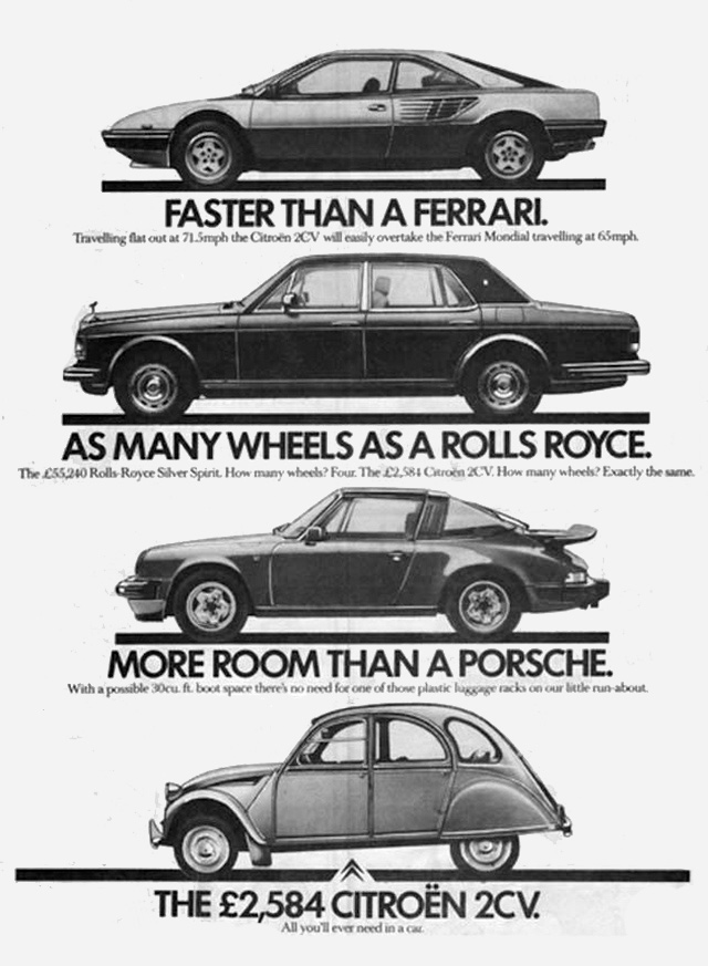
The second ad I chose to analyze was a similar ad for a budget car that compared it to other more expensive or famous cars. The ad is simple but more text heavy compared to the previous Daihatsu ad. The ad is also in black and white and draws your attention to the bold statements made about the car in question. The black and white combination brings attention to the recognizable outlines of both the comparison cars and the car being advertised.
This advertisement is meant to appeal to practical people and makes heavy use of logos when comparing the cars. It uses logical statements that show how the much cheaper Citroen is better in more practical ways when compared to the more expensive cars. The car manufacturer, Citroen is known for their practical and cheap cars which is shown in this ad. The subtext of the ad is that people who buy more expensive care are just wasting money because the citroen has all the necessary features for a car and none that you don't need or can't use. One example of this is the statement in the ad “Traveling flat out at 72.5 MPH the Citroen 2CV will easily overtake the Ferrari Mondial traveling at 65 MPH”. This statement is meant to show how the extra speed of the Ferrari is not useful in everyday driving and that kind of speed is a pointless reason to buy a car. This add does make sense to me and makes a good case for the car. It uses facts and smart comparison to demonstrate that it is unnecessary to purchase an expensive car when all you will use it for are the same basic tasks that the Citroen can do .


Comments
Post a Comment